The first disc records, ones that we would recognize as such, appeared around 1910. Most often these were packaged in plain brown Paper or cardboard sleeves. Occasionally and enterprising retailer would print his store name on the sleeve but generally they were unadorned.

In the early 1920's retailers started gathering many of these cardboard sleeves and binding them together with heavy paperboard or leather covers. These looked similar to large photo albums and, borrowing the name, were sold as record albums. These albums offered much greater protection for the discs than the original packaging and were seen as indispensible to disc owners that had seen too many of their fragile records broken.

Beginning in the 1930s the record companies started using these record albums to distribute bundles of records from one performer or a collection of performers with similar musical styles. Some of the first cover designs can be traced to these albums and the record company’s desire to graphically communicate the music each album held.

Alex Steinweiss the art director for Columbia Records is given credit for the concept of modern cover art. He experimented with different concepts and images through the late 1930s and into the early 1940s. During this time Columbia Records rebounded from the terrible years they had suffered during the depression to become one of the most prominent record companies in the United States. Much of this was due to their ground breaking use of graphical design. By the close of the decade all major recording companies had graphic design professionals on staff.

The golden era of cover art design began in the early to mid 1960s and lasted into the early 1980s. During this time the major format for music was the 12 inch, long play disc or LP. Cover art became a part of the musical culture of the time. Often used to express graphically the musician’s artistic intent, it helped connect and communicate to listeners the message or underlying theme of the album.

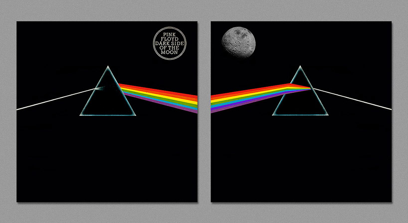
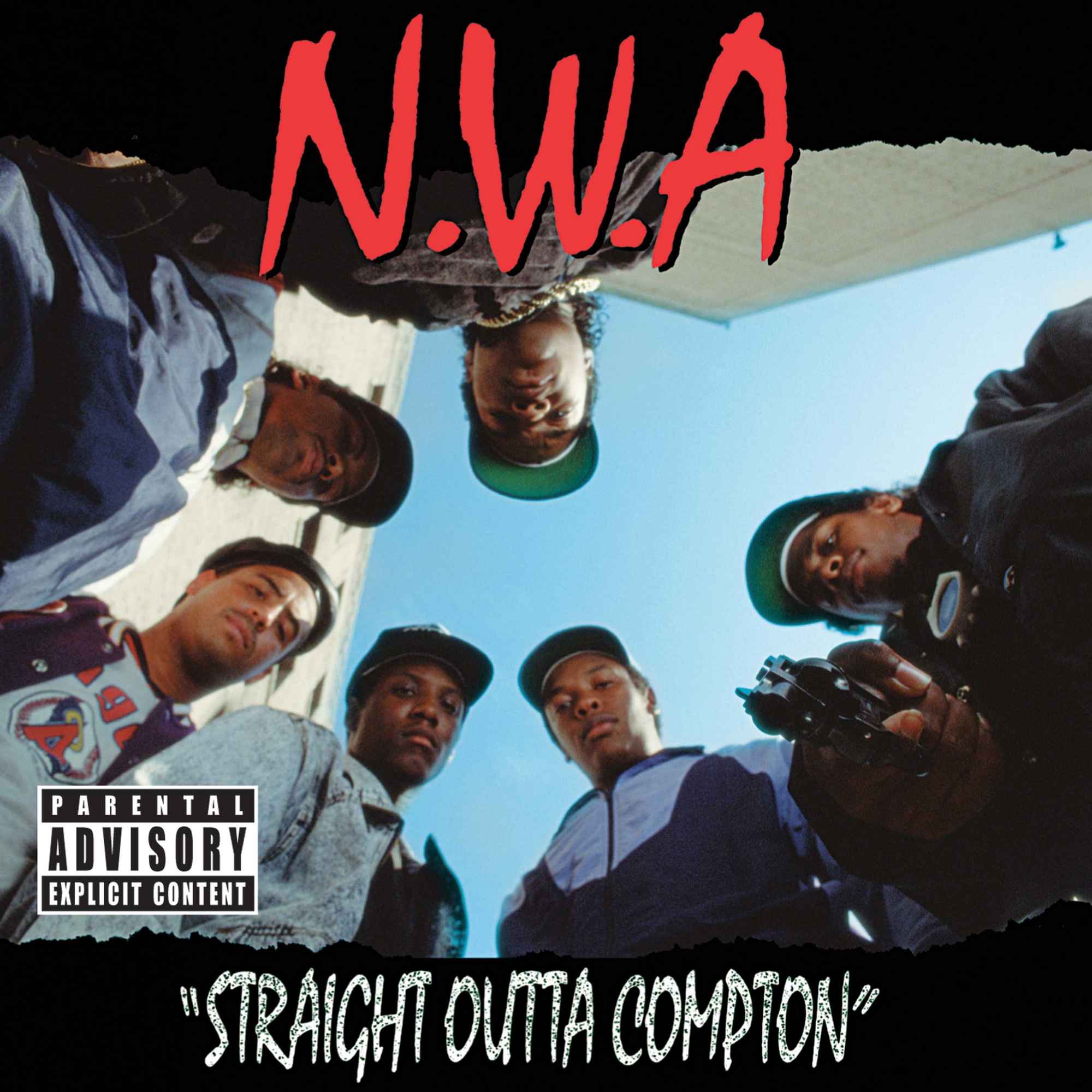
Designers, photographers, and illustrators sometimes became famous for their cover art creations. Such notables as Andy Warhol and Frank Frazetta were taken from being known in their industry to becoming household names due to their cover art graphic design work. So respected and desired are the designs and illustrations found in cover art that there are numerous art galleries that specialize in helping collectors find rare album covers.

As the medium for recording transitioned from the LP to the compact disc many graphic designers failed to transition with it. Having worked for so long with the much larger canvas of the LP cover, switching to the smaller CD case left most designers dissatisfied with their results. Often artist and record companies simply tried to shrink the LP size art to fit the CD.

Album cover art, now almost exclusively CD and CD packaging artwork, went through a period of change and rebirth in the 1990s. Designers learned to capture snapshots and portions of the artist’s musical intent rather than trying to convey the entire message. Also designers started conveying the emotion of the music rather than the musical intent.

In the late 90s computer design programs started to overcome the physical limitations of the smaller CD packaging. With the ability to draw much tighter, finer lines and have even small details look crisp and sharp, once again designers were free to explore a larger variety of design options. As the technology continued to improve graphic designers adapted and were once again producing world class artwork.

In the present, CD design is undergoing a true renaissance. Rather than becoming obsolete in the digital age as many thought it would, graphic design is once again proving itself as the difference maker. The internet is now the largest record store imaginable. Now rather than browsing a few hundred albums or songs at a time you may be exposed to thousands and thousands. Since it would be impossible to listen to portions of all those thousands of songs the design of the accompanying artwork must cause potential listeners to stop and take notice and give this album a try.

CLICK HERE to watch a video which provides an interesting take on the implications of album artwork in relation to marketing.

CLICK HERE to watch a video which provides an interesting take on the implications of album artwork in relation to marketing.
Research : CD Digipacks Existing Products
Research: CD Digipacks common conventions
Front cover:
The common conventions that often feature on the front cover of a cd digipacks are the name of the album which the cover is a heavily featured part of the digipacks also the name of the artist/band featuring along with the name of the album in a font that usually co insides with the genre of music that the artist produces for example for example the stone division font is very worn and bold and they produce rock/heavy metal music. The image in the background of the cover usually relates to the genre of music and themes that feature amongst the album for example ill keep calling with a man on the pay phone trying to make a call. Another big part of the front cover is the colours used for example the dark coulors used on stone divisions album such as the dark shades of red that could symbol a number of different emotions in relation to the style and genre of the music wether it be love, hate or anger. Or on the album milooxyloto there is various different vibrant colours used in the form of graffiti all splattered on a wall this could highlight the number of different emotions with the vibrant colours.
Back cover:
From the album digipacks that i have looked at the common features on the back of a digipacks appear to be, the track list on the back featuring every track within the album usually in the same style font to the artist name and album title. they also most commonly feature album specific barcodes in order for the album to be purchased and findable. various credits and different logos for example record labels, copyright statements as well as contact information for example websites and social medias to keep in touch wth the artist and the music that they produce. another convention of the back cover is the album title featuring again both on the front and back of the album covers.
Planning: CD Digipack initial ideas
For my album digipacks i will include genre specific fonts and styles among the foreground for example handwriting styled fonts for example either messy or handwritten styles some like the examples included below when it comes to adding the album title and artist name to the didgipack.


within the background i will include an image of the main actor for the music video in a close up image where he s either looking away or towards the direction of the camera, this image will either be taken/set in the park area that i will film in or in the light theatre. this image will either feature the normal and standard tones or i could choose to use a filter in order to match the colours specific codes that come with the acoustic genre. in this style


For the back cover of my digipack i will have the trackless for the album in a font of a similar style to the one used on the front cover as well as an album specific barcode that will be distinct for this select album. the back cover will also feature various copyright statements in relation to the artist and companies involved as well as the record label and distribution company and any social media relating to the artist i order t promote his music. however the background will be very similar to the front cover by featuring a picture of the artist in normal and standard tones. in a style similar to this example

Planning: Digipack Sketches
these are the sketches that i have produced to explore my ideas regarding my cd digipack design to decide which to proceed with for the actual design of the cd-digipack.
Sketch 1:

Sketch 2:

With this idea i have used again the main actor for the music video however i have tried to tie in the idea of the guitar which is heavily used by acoustic/singer songwriter artist throughout their work and therefore i have used i here amongst this digipack sketch/design.
Sketch 3:

this sketch again focuses on the actor for the music video again in a natural rural location surrounded by wildlife as well as various different images from places such as Wicksteed park and an image of the statue of children playing in the water as well as images of the trees and nature.
Planning: digipack ideas audience feedback
This is the audience feedback which i have recorded in which the audience member who i have interviewed believes that sketch number 1 would be best fitting for the music video and album that i will produce. the design is based around the primary filming location that i will use in the filming of my music video as well as all of the useful and common conventions of digipack cover.
CD Digipack:
Creating the CD Digipack:
When creating my CD Digipack i decided to stick with the practice designs and ideas that o originally came up with by using shots of the actor in a park setting with various trees and wildlife however various aspects of the digipack ideas changed over time with me doing the filming and testing out what looked best for the design


This image is the basic template of the CD Digipack with all of the images inserted and then the rectangle cut outs to give it the white border around the images.

This image is of the front cover in which i had to use two laters and drop the opacity of the behind layer and blur the edge of the tree in order to be able to see the text on the front cover of the digipack.

This is an image of the back cover wit the barcode, record labels and copyright statements on top of the image

This is the rear cover then with the track list inserted onto the road and fitting with the road and the width the whole way down.

This is again another image of the back cover however now with the artist name and album name vertically on the rim of the digipack in black text.

This is then the image of the front cover with the opacity dropped now featuring text in the Marion font using green text colour of the artist name and the album title.
Final CD Digipack:

This is the final design for my CD Digipack, and i am very pleased with how it has turned out as it links very well to both the music magazine and the music video in that it features similar photographs and locations to the two. so it will be easier to link and discuss the 3 in my evaluation. i personally believe that it has a very professional and formal look and would fit well on most shelves in music stores.
No comments:
Post a Comment